
100 East Fine Jewelry is committed to the use of color in our jewelry as we predominantly sell white gold and yellow gold jewelry , featuring colored gemstones , or mixed colors of metal. That’s why, when designing our jewelry pieces and buying our gemstones, we follow, with interest, the bi-annual Pantone Fashion Color Report issued each spring and fall.
About Pantone’s Fashion Color Reports:
Each year, since the 1990’s, the Pantone Color Institute, a trend forecasting and color consultancy, has provided bi-annual fashion color reports covering the spring/summer and fall/winter fashion seasons. In conjunction with New York Fashion Week in September, 2017, the spring 2018 color report was announced. In the fashion report, the Pantone Color Institute features the top colors we can expect to see from fashion designers on the runway for the upcoming spring collections. In case you missed last September’s release, according to the Pantone website:
“With the use of color gaining in importance, the PANTONE Fashion Color Trend Report Spring 2018 edition features the top 12 colors for men’s and women’s fashion, highlighting a more multi-faceted color story that expands the opportunity for self-expression. For the first time this year, the report also includes four classic colors, which transcend seasons and provide structure to any wardrobe.
‘As consumers continue to embrace color, designers are recognizing the need to show more color in their collections.’ says Leatrice Eiseman, Executive Director of the Pantone Color Institute. ‘In order to reflect the consumers’ ongoing fascination with color, we broadened the direction for Spring 2018 to show where hues are headed by including 12 outstanding call out colors as well as four spring classics.’
Along with this recognized freedom to explore and experiment with more color, experts at the Pantone Color Institute note that fashion, and the people who interact with it, no longer want to limit themselves by following traditional color guidelines. Untypical spring shades that make for complex and original combinations expand the opportunity for self-expression and communicate the consumer desire to experiment with color all year round. The palette for Spring 2018 is a perfect reflection of this new sentiment.”
The color of the year isn’t always included among the 12, but Ultra Violet, 18-3838 (see our blog on the Pantone Color of the Year) made it into this year's selection.
Pantone's Top Colors for Spring 2018

As reported on the Pantone website: “The color palette showcases an appreciation for the complexity and distinctiveness of color and the expression of it, which is something that evolves and can be played with,” said Eiseman. “Consumers need more variety, and this expanded palette embraces the lack of gender and seasonal borders we are seeing within the fashion industry.”
Meadowlark - PANTONE 13-0646; The bold and lively Meadowlark, a confident and outgoing bright yellow shade highlights the spring 2018 season, glistening with joy and illuminating the world around us. We currently offer yellow diamond ring and earrings similar in color to Meadowlark.
Cherry Tomato - PANTONE 17-1563; Impulsive Cherry Tomato is a tempestuous orangey red that exudes heat and energy. Demanding attention, this courageous, never to be ignored shade is viscerally alive. Our cherry tomato inspired jewelry pieces include Oregon sunstone earrings.
Little Boy Blue - PANTONE 16-4132; With the expectation of the clear blue sky, Little Boy Blue is no longer for little boys only. Suggestive of expansiveness and continuity, this azure blue shade reassures us with its promise of a new day. Little Boy Blue’s sky blue color can be represented by our blue topaz jewelry.
Chili Oil - PANTONE 18-1440; Seasoned yet season-less, Chili Oil is an earthy brown based red that adds flavorful definition to the Spring 2018 palette.
Blooming Dahlia - PANTONE 15-1520; With its seemingly suggestive scent, the subtly alluring Blooming Dahlia beckons us with its understated appeal.
Pink Lavender - PANTONE 14-3207; Pink Lavender is a soft and romantic violet rose that charms with its soothing sense of quiescence. We are currently offering a lovely amethyst pendant on a sterling chain with a lavender similar in nature to this Pantone spring color.
Arcadia - PANTONE 16-5533; Hinting at retro yet at the same time modern, Arcadia is a cooler, cleaner take on green; its tinge of blue undertone takes us into a new direction for the spring 2018 season.
Ultra Violet - PANTONE 18-3838; Conveying originality and ingenuity, the magical Ultra Violet is a distinctive and complex purple shade that fascinates and intrigues. Some of our amethyst jewelry pieces are fabulous matches with ultra violet!
Almost Mauve - PANTONE 12-2103; With its gentle petal like touch, delicate and ephemeral Almost Mauve adds a sense of nostalgia to the spring 2018 palette.
Emperador - PANTONE 18-1028; The rich chocolate infused brown Emperador adds strength and substance to the spring 2018 palette.
Spring Crocus - PANTONE 17-3020; Witty and expressive, Spring Crocus is a flamboyant and tantalizing fuchsia shade that summons you in with its beguiling charm.
Lime Punch - PANTONE 13-0550; Sharp and pungent, Lime Punch hits a chord with its strident and striking citrus like presence in the spring 2018 color palette. A color which is similar to that of our peridot jewelry pieces, which will brighten any spring day.
About the Spring 2018 Classic Color Palette:
According to the Pantone website: “For many consumers, classic color is the mainstay of the wardrobe and the foundational core upon which they start building their own personal style. ‘We want to reflect consumers’ increased desire for color, and felt that if we included these core basics into our top color call outs, we would be forced to limit the number of colors we thought deserved special attention,’ said Eiseman. ‘At the same time, the core classic shades play a critical role in any wardrobe, and we also want to highlight the nuance of these classic colors for the spring 2018 season.’
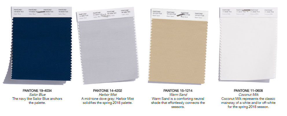
Sailor Blue - PANTONE 19-4034; The navy like Sailor Blue anchors the palette. We have the perfect pieces to match this palette in our blue sapphire jewely pieces!
Harbor Mist - PANTONE 14-4202; A mid-tone dove gray, Harbor Mist solidifies the spring 2018 palette.
Warm Sand - PANTONE 15-1214; Warm Sand is a comforting neutral shade that effortlessly connects the seasons.
Coconut Milk - PANTONE 11-0608; Coconut Milk represents the classic mainstay of a white and/or off-white for the spring 2018 season.
About 100 East Fine Jewelry’s Jewelry Offerings:
If your fashion needs call for jewelry pieces to match or complement clothing or accessories similar to the Pantone 2018 spring colors palette, feel free to check out our collection of fine jewelry offerings at www.100eastfinejewelry.com.