Pantone LLC is a world renowned authority on color and color systems. They are known globally as providing the standard language for accurate color communication across a variety of industries and throughout the supply chain. The Pantone Color Institute is a color research and information center which shares its color expertise with professionals in a variety of industries, including fashion.
Each year, the Pantone Color Institute issues 3 major publications with implications for the fashion industry; the Color of the Year, its Spring Fashion Color Trend Report and its Fall Fashion Color Trend Report. The Pantone Color Institute staff evaluates the colors shown by fashion designers in their men’s and women’s collections at New York Fashion Week. This information is then used to develop The Pantone Fashion Color Report for fall. In this report, the top 10 colors for men’s and women’s fashion for the upcoming season are revealed. For the first time ever, The PCI added London Fashion Week to their seasonal color reports.
According to Leatrice Eiseman, Executive Director of the Pantone Color Institute, as reported on their website. “There is a commonality between the colors we are seeing on the runway in New York and London. However, individuality is evident and we are seeing a distinct difference between the shows in the two cities in the way these same colors are being combined.”
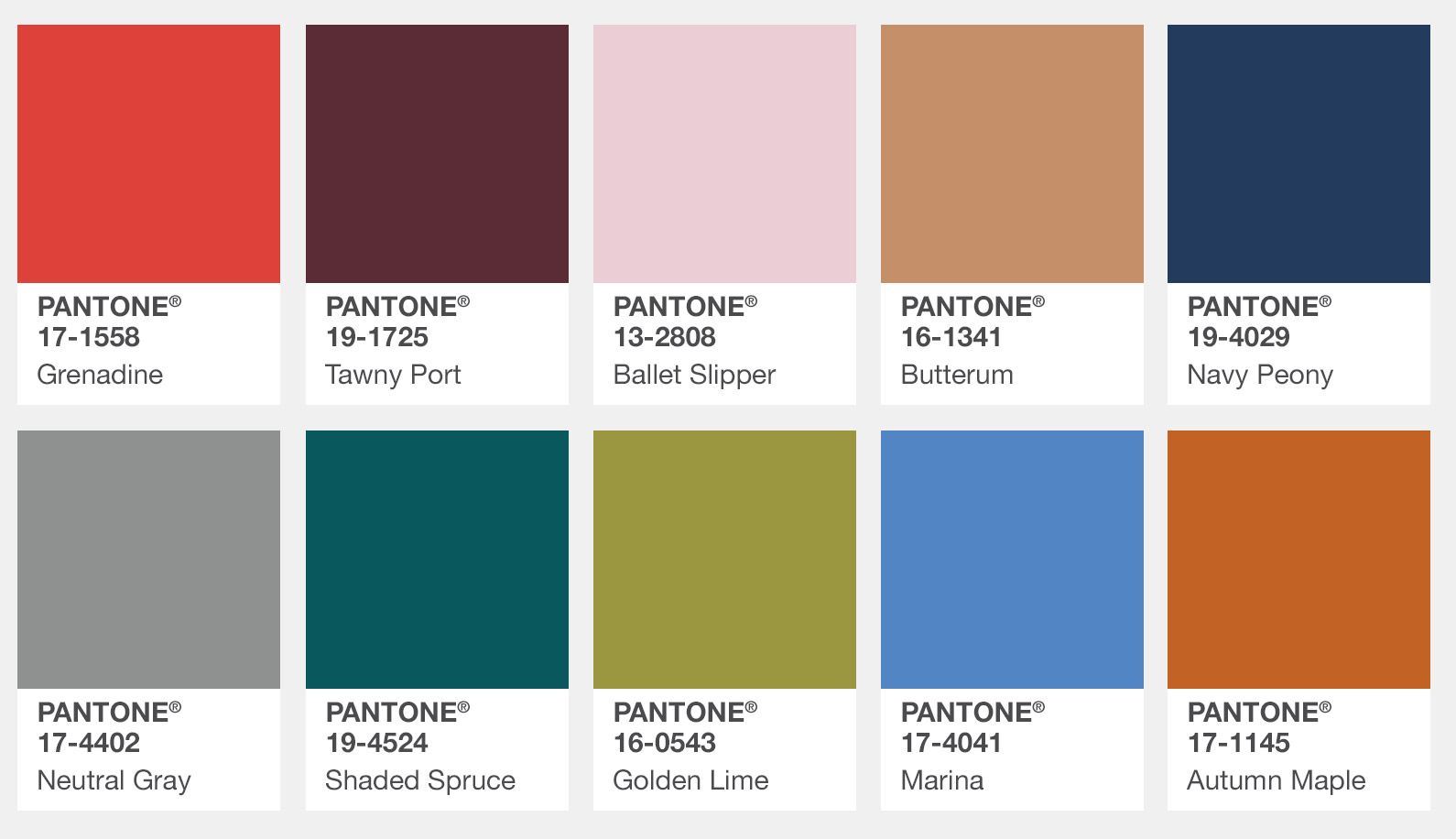
2017 Fall and Winter Fashion Color Palette for New York
As further quoted by Ms Eiseman, “Bookended by a dynamic Grenadine red and a tawny Autumn Maple, the color palette for Fall and Winter 2017 leans more to warmth. While comforting, enveloping colors and ease are crucial to the seasonal feeling, standout shades include a pale pink Ballet Slipper, a refreshing Golden Lime, and a bright Marina blue. These hues add a striking touch when paired with the classic autumnal shades of Navy Peony, Neutral Gray, Butterrum and Tawny Port.”

Following is a brief descriptor of each of this year’s fall and winter colors from New York:
Pantone 17-1558 Grenadine - A powerful, evocative, dynamic red, Grenadine is a confident and self-assured attention-getter.
Pantone 19-1725 Tawny Port - Taking the Red family to new depths, Tawny Port is elegant, sophisticated, and tasteful.
Pantone 13-2808 Ballet Slipper - Descended from the Red family but with a softer touch, Ballet Slipper is always flattering and reminiscent of the rosy glow of health.
Pantone 16-1341 Butterum - This snug, warming, and toasty shade is evocative of drinking a glass of Butterrum by a roaring fire on a cool autumn evening.
Pantone 19-4029 Navy Peony - A mainstay for the season for both palettes, Navy Peony is a dependable and an anchoring shade. Solid and stable, the hue takes some of the load off of black as a go-to neutral.
Pantone 17-4402 Neutral Gray - The standard bearer of all neutrals, Neutral Gray shares the anchoring role with Navy Peony in this palette. It can be used as an accent or a head-to-toe statement shade.
Pantone 19-4524 Shaded Spruce - This is a green you might see in the forest – sheltering and protective as evergreen trees.
Pantone 16-0543 Golden Lime - Earthy tones with a twist, the golden undertones of Golden Lime makes this yellow-green shade a refreshing complement to fall classics.
Pantone 17-4041 Marina - Cool with an enhanced vitality, Marina is the only truly cool color in the fall palette that brings with it freshness and brightness.
Pantone 17-1145 Autumn Maple - A quintessential autumn color, Autumn Maple is tawny and russet, introducing warmth into the palette.
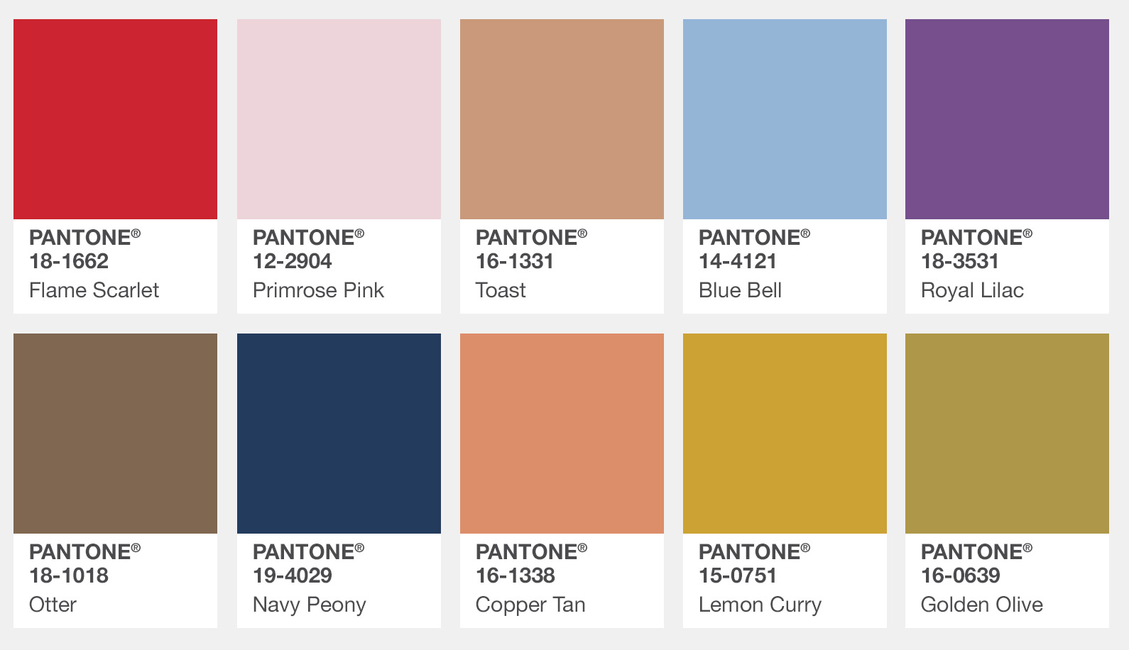
2017 Fall and Winter Fashion Color Palette for London
Ms Eiseman concluded: “Led by a vivid Flame Scarlet, the color palette for Autumn/Winter 2017/2018 is comprised of strong classics colors complemented by a few unpredictable shades for the autumn and winter seasons. Unexpected combinations such as Royal Lilac and Otter Brown or Lemon Curry with Bluebell are eye-arresting and create an unusual color dichotomy.”
PANTONE 18-1662 Flame Scarlet - A vivid, powerful red, this strong shade leads the way in for Fall in London.
PANTONE 12-2904 Primrose Pink - An embracing and gentle pale pink shade.
PANTONE 16-1331 Toast - Toast brings a comforting, warmhearted presence to the autumn winter season.
PANTONE 14-4121 Bluebell - This tranquil blue reflects connection and a soothing sense of peace.
PANTONE 18-3531 Royal Lilac - An enchanting purple, Royal Lilac provides a theatrical linkage to the other colors in the palette.
PANTONE 18-1018 Otter - A country color that comes to the city, Otter adds an earthy grounding and a sense of rootedness.
PANTONE 19-4029 Navy Peony - Just as we saw in New York, the dependable and anchoring Navy Peony is a mainstay for the season. Solid and stable, the hue takes some of the load off of black as a go-to neutral.
PANTONE 16-1338 Copper Tan - Copper Tan, a burnished shade known for its welcoming warmth.
PANTONE 15-0751 Lemon Curry - Exotic and spicy, Lemon Curry adds a touch of piquancy to the seasonal color story.
PANTONE 16-0639 Golden Olive - A staunch yet stately green Golden Olive provides sturdiness.
100 East Fine Jewelry has jewelry pieces which are designed to beautifully complement any of your 2017 fall and winter fashions. Navy Peony is the only color which overlaps the New York and London palettes. We have lovely blue sapphire jewelry pieces which would go along exquisitely with any ensemble featuring Navy Peony.
Credit for images and color descriptions: Pantone LLC website https://www.pantone.com/fashion-color-report-fall-2017

