
100 East Fine Jewelry is all about color. We specialize in selling jewelry pieces containing colored gemstones or with multiple colors of metal. That’s why we follow, with vested interest, the bi-annual Pantone Fashion Color Report which is issued each spring and fall.
About Pantone’s Fashion Color Reports
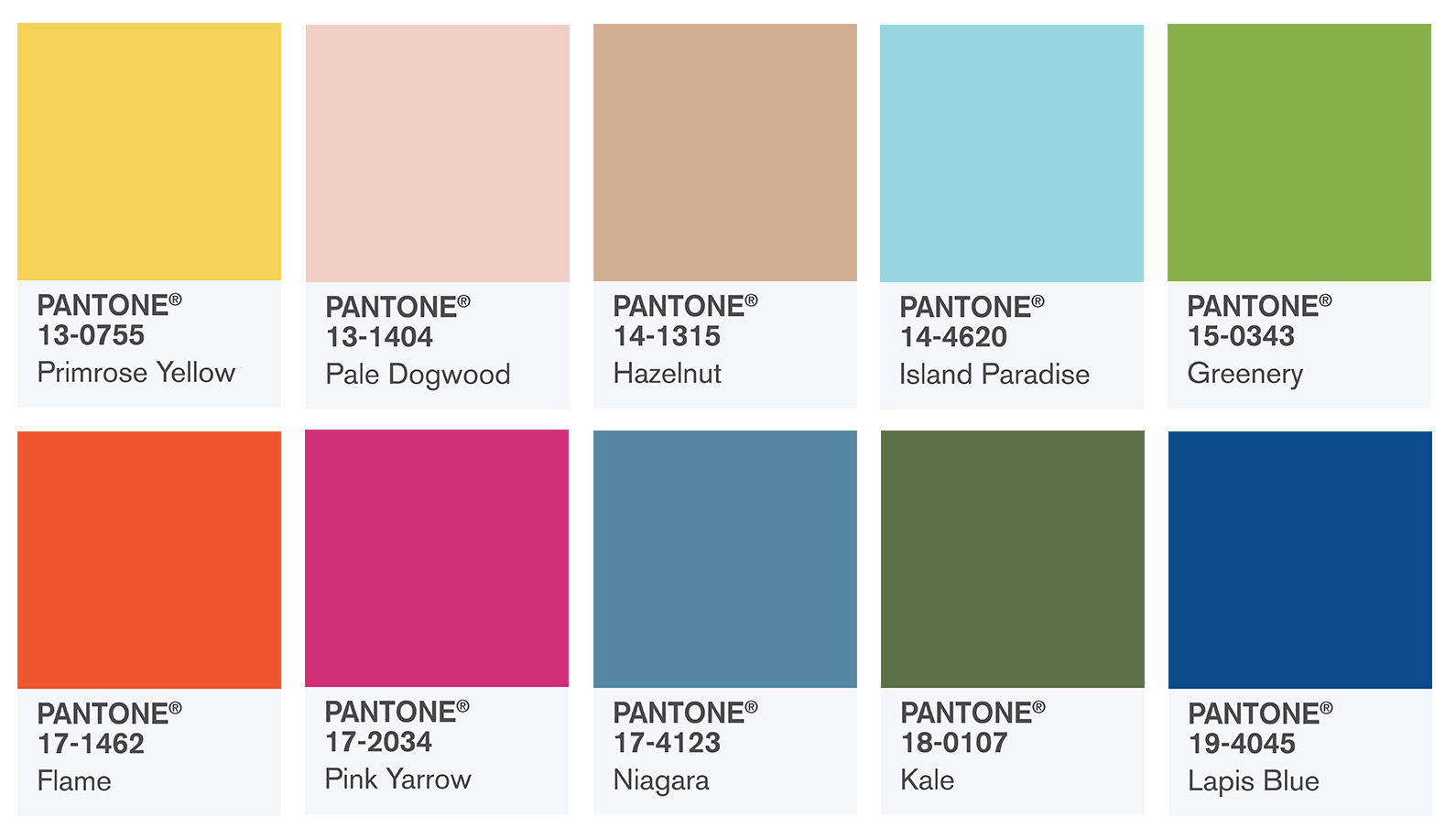
Each year since the 1990’s, Pantone has published bi-annual fashion color reports covering the spring/summer and fall/winter fashion seasons. In these reports, the Pantone Color Institute reveals how fashion designers are using color in their upcoming collections. In September, 2016 in conjunction with New York Fashion Week , the Fashion Color Report Spring 2017 was announced. In case you missed last September’s release, below you’ll find the top 10 trending 2017 colors being used in this spring/summer fashion season. Though the color of the year isn’t always included in the top 10, Greenery, Pantone 15-0343 (see our blog on the Pantone Color of the Year) made it into this year's selection.
Pantone's Introduction of the Top 10 Colors for Spring 2017
As reported on the Pantone website:
“A mixture of vitality, relaxation and the great outdoors.
One of the things that we saw this year, was a renewed sense of imagination in which color was appearing in context that was different than the traditional," said Leatrice Eiseman, Executive Director of the Pantone Color Institute. "Reminiscent of the hues that surround us in nature, our Spring 2017 Fashion Color Report evokes a spectrum of emotion and feeling. From the warmth of sunny days with PANTONE 13-0755 Primrose Yellow to the invigorating feeling of breathing fresh mountain air with PANTONE 18-0107 Kale and the desire to escape to pristine waters with PANTONE 14-4620 Island Paradise, designers applied color in playful, yet thoughtful and precise combinations to fully capture the promises, hope and transformation that we yearn for each Spring."
Pantone's Top 10 Colors for Spring 2017 Fashion and color narratives:
NOTE: The following color narratives are directly from the Pantone website. References to specific jewelry pieces were provided by 100 East Fine Jewelry.
PANTONE 17-4123 Niagara
Comfortable and dependable, Niagara leads the PANTONE Fashion Color Report as the most prevalent color for spring 2017. Niagara is a classic denim-like blue that speaks to our desire for ease and relaxation .
Check out 100 East Fine Jewelry’s similarly hued zircon and diamond hoop-style and dangling earrings in 18 kt white gold .
PANTONE 13-0755 Primrose Yellow
By contrast, Primrose Yellow sparkles with heat and vitality. Inviting us into its instant warmth, this joyful yellow shade takes us to a destination marked by enthusiasm, good cheer and sunny days.
Please see 100 East’s similarly hued Montana yellow sapphire and diamond dangling earrings in 18 kt white gold .
PANTONE 19-4045 Lapis Blue
Conveying even more energy is Lapis Blue. Strong and confident, this intense blue shade is imbued with an inner radiance.
100 East offers a variety of blue sapphire jewelry items with a similar hue
PANTONE 17-1462 Flame
A red-based orange, Flame, is gregarious and fun loving. Flamboyant and vivacious, this wonderfully theatrical shade adds fiery heat to the spring 2017 palette.
While we don’t have any items this color, if you like orange, take a look at our Montana orange sapphire and diamond earrings in 14 kt white gold .
PANTONE 14-4620 Island Paradise
Island Paradise is a refreshing aqua that calls to mind a change of scenery. A cool blue green shade that speaks to our dream of the great escape, Island Paradise is emblematic of tropical settings and our desire to unwind.
PANTONE 13-1404 Pale Dogwood
Continuing the tranquil mood, Pale Dogwood is a quiet and peaceful pink shade that engenders an aura of innocence and purity. The unobtrusive Pale Dogwood is a subtle pink whose soft touch infuses a healthy glow.
While 100 East may not have this exact hue, we do carry a pink sapphire ring and a set of pink sapphire earrings which you may enjoy.
PANTONE 15-0343 Greenery
Check out our other blog about Greenery being the Pantone color of the Year! Bringing forth a refreshing take, Greenery is a tangy, yellow-green that speaks to our need to explore, experiment and reinvent. Illustrative of flourishing foliage, the fertile attributes of Greenery signals one to take a deep breath, oxygenate and reinvigorate.
100 East Fine Jewelry offers yellow-green peridot ring, earrings, bracelet or necklace in 14 kt white gold .
PANTONE 17-2034 Pink Yarrow
Tropical and festive, Pink Yarrow is a whimsical, unignorably tempting and tantalizing hue. Bold, attention getting and tempestuous, the lively Pink Yarrow is a captivating and stimulating color that lifts spirits and gets the adrenaline going.
While 100 East may not have this exact hue, we do carry a selection of pink sapphire pieces (ring and earrings) which you may enjoy.
PANTONE 18-0107 Kale
Evocative of the great outdoors and a healthy lifestyle, Kale is another foliage-based green that conjures up our desire to connect to nature, similar to the more vivacious Greenery. And, just as we see in nature, this lush and fertile natural green shade provides the perfect complementary background to the more vibrant tones in the palette.
Check out 100 East’s Tourmaline and diamond cocktail ring in 18 kt white gold with a similar hue.
PANTONE 14-1315 Hazelnut
Rounding out the spring 2017 colors is Hazelnut, a key neutral for spring. This shade brings to mind a natural earthiness. Unpretentious and with an inherent warmth, Hazelnut is a transitional color that effortlessly connects the seasons.
For more details about Pantone, refer to our prior blog on the Pantone Color of the Year for 2017, or visit their website.